HEWI MAG / Knowledge
Design contrasts
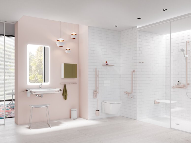
To understand color and contrast means learning to see in a new way. Their interaction always works in the context of the architecture. The need for security and orientation plays a major role in all areas of life – but especially within publicly accessible buildings, offices and commercial buildings, or buildings in the healthcare sector. Colors and contrasts are essential for patients and residents in hospitals and nursing homes in particular. With deteriorating eyesight as we get older or in the case of dementia, the design of rooms and equipment, in hallways or bathrooms for example, can have a major impact on independence and orientation, and thus on people's quality of life and wellbeing.
Color gives structure
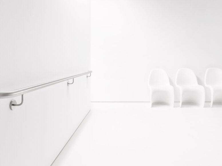
Colors and contrasts can provide an intelligent guidance system throughout a building. Color structures rooms and clearly differentiate one area from another. A coherent color concept serves as an aid to orientation, for example making it easier to find a floor, ward or station. Colored accents give long corridors depth and structure, especially with handrails, door frames and door handles that are color-coordinated. Rooms with limited access can be merged into the background with neutral colored doors and door handles.
For the clear conveyance of information, communication and orientation systems should be designed according to the two-senses principle. This means, the simultaneous transmission of information via at least two senses (sight, hearing or touch). HEWI offers a wide range of solutions when it comes to fittings and sanitary facilities, where a missing or limited perception is compensated for by a different sense.
Functional clarity
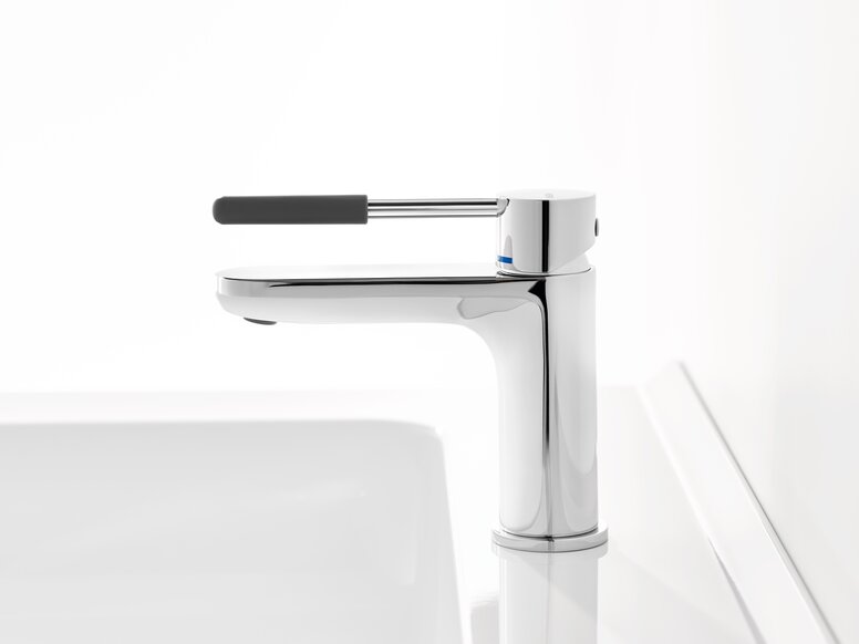
Deteriorating visual acuity can make it difficult to grasp the impression of a room. Clear colors and contrasts can really help orientation. The degree of contrast always depends on the color of both product and background. With the help of light reflectance value (LRV), contrast can be theoretically calculated. As a guide, colors with a low LRV create the greatest contrast against a white wall, for example, a black product on a white wall. HEWI specifies the LRV value for the colors we use to guarantee the best possible design options.
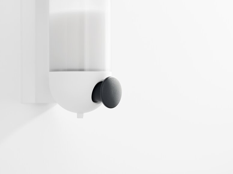
Contrast indicators can also be used within individual equipment solutions. As we’ve seen, products with contrast are more easily perceived when they stand out against the background. So, if only the functional area of a product is colored, that contrasting accent signals and supports intuitive use.
