HEWI MAG / Knowledge
Colours and contrasts give people better orientation in space
The need for security and orientation plays a major role in all areas of our lives. The interplay between colours and contrasts in orientation always works in the context of architecture. In this article we discuss how colours and contrasts can be used to make people's everyday lives easier.
In the case of declining eyesight as we get older or in the case of target="_blank">dementia, the design of rooms and their furnishings, for example in corridor areas or the bathroom, can have a decisive influence for independence and orientation and thus for our well-being.
Facilitating orientation is particularly helpful in publicly accessible buildings, office and commercial buildings or buildings in the healthcare sector. Especially in hospitals or nursing homes, colours and contrasts are essential for patients and residents.
How colours give people structure
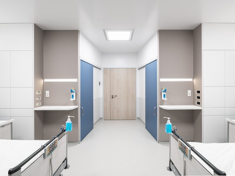
Colours and contrasts can serve as a well thought-out guidance system in buildings. Colour structures rooms and clearly demarcates building areas from one another. A coherent colour concept serves as an orientation aid, for example to make it easier to find a floor or ward again.
Long corridors can be divided by colour accents, such as colour-coordinated target="_blank">handrails, door frames and handles. Rooms that do not allow access to everyone can be made to recede into the background by neutral-coloured doors and door handles.
For the clear communication of information according to DIN 18040-1, information and orientation systems should be designed according to the two-senses principle. This means the simultaneous transmission of information via at least two of our senses (sight, hearing or touch). HEWI offers a wide range of solutions for the areas of fittings and sanitation in which the missing or limited perception is compensated for by another sense.

How functions convey orientation
Declining eyesight makes it more difficult to grasp the impression of space. Orientation can be supported by a clear colour scheme and distinct contrasts. The strength of the contrast always depends on the colour of the product and the colour of the background. Theoretically the contrast value can be determined with the help of the light reflectance value (LRV).
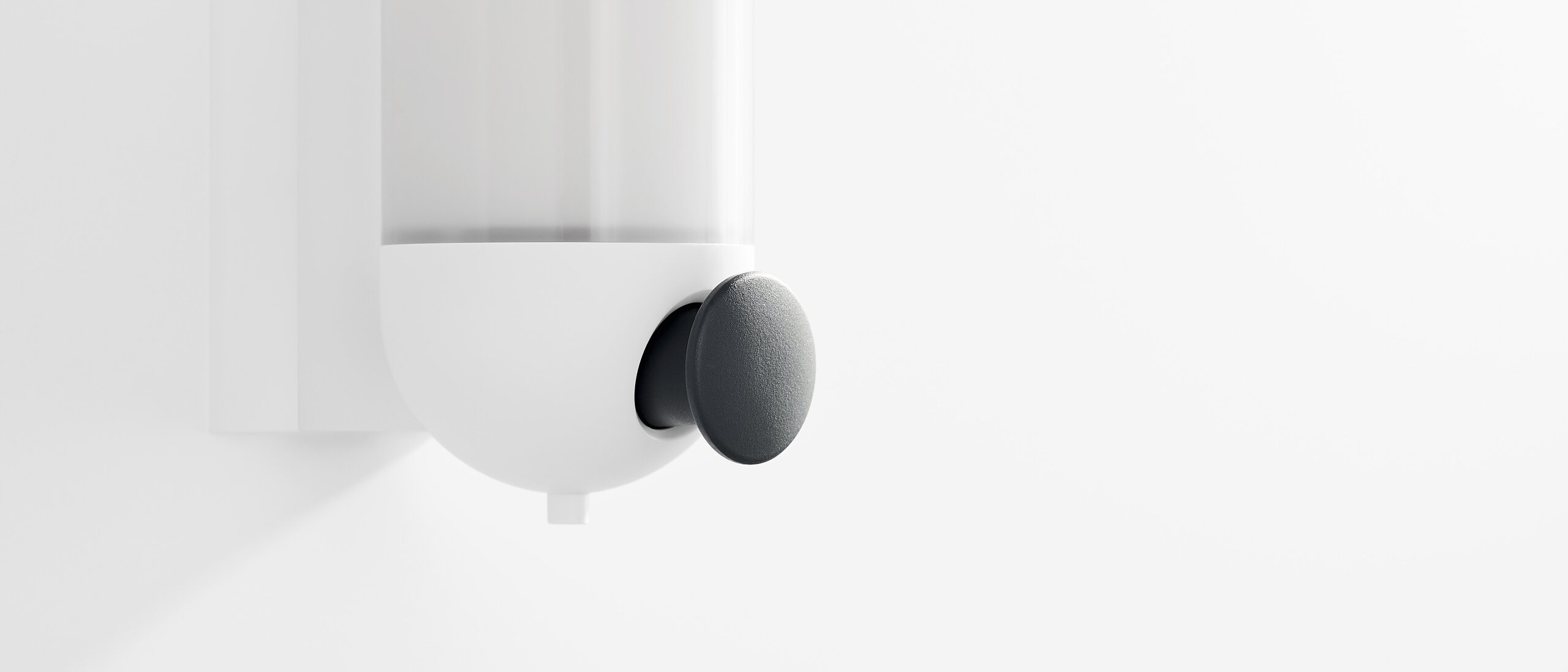
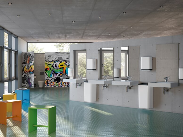
As a guideline though, colours with a low LRV value form the highest contrast against a white wall, for example, a black product on a white wall. HEWI specifies the LRV value for the colour to ensure the best possible design options.
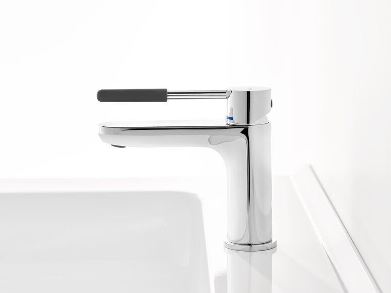
The use of individual equipment solutions can also be signalled by contrasts. Supporting products are more easily perceived if they stand out against the background in high contrast. If purely the functional area of the product is designed in colour, that colour accent signals its use and naturally supports its intuitive use.


