HEWI MAG / Design
Barbie meets boutique hotel: Why pink is the new colour for design-oriented hotel concepts
The pink hotel trend sets new standards in boutique hotel design and modern interior design hotels. The colour world encompassing pink, magenta and pastel shades, which has been reinforced by the global "Barbiecore" hype, is also increasingly influencing the hotel industry. Colour psychology hotel design plays an essential role in this: Guests experience rooms not just functionally, but emotionally. The targeted choice of colours can have a positive effect on guest satisfaction, increase well-being and contribute to a differentiated brand positioning.
The strategic importance of colour concepts in the hotel industry
Colours unconsciously influence the behaviour and mood of guests. Studies show that warm and harmonious colour tones can extend the length of a stay and promote a positive association with the hotel brand. Pink as a trend colour is no longer just a fashion statement, but is increasingly being used as a design tool in architecture and the hotel industry.
Colour psychology hotel design shows that pink can have a calming or activating effect, depending on the intensity and combination. Combined with neutral or muted colours, it creates a modern, high-quality ambience. Pink is used as a brand-defining element, particularly in boutique hotel design and design-orientated hotel concepts.
Design meets accessibility: Functional aesthetics in boutique hotel bathrooms
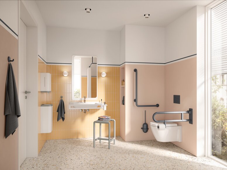
The combination of aesthetic design and accessible functionality is becoming increasingly important in the hotel industry. Modern hotel bathrooms must meet high standards of comfort, durability and inclusivity without compromising on design.
HEWI offers innovative sanitary solutions that are characterised by timeless design and high material quality. Well thought-through colour concepts and functional elegance enable a design that is inclusive and at the same time sets design accents. Rail systems, shower seats and brackets in soft shades of pink blend harmoniously into modern interior design hotel concepts and help to create a stylish yet accessible environment.
Barbie™ × HEWI: Two icons, one vision
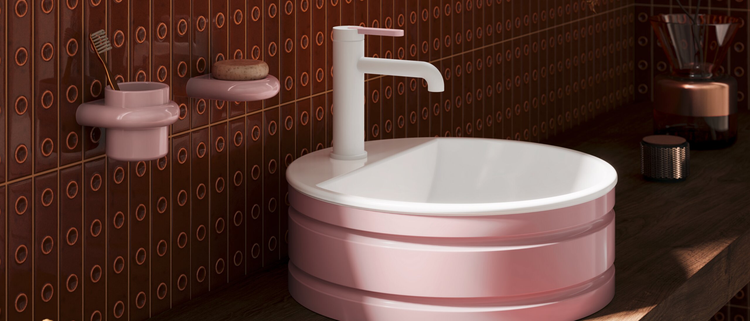
The exclusive Barbie™ x HEWI sanitary collection combines Barbie's iconic world of colour with the principles of timeless design. The collection sets standards for aesthetics and functionality and reflects the central values of the modern hotel industry: Individuality, inclusivity and high-quality comfort and convenience.
With almost 40 products – from towel holders and toilet brush units to barrier-free hinged support rails – the collection offers a new dimension in design. High-quality materials, durable workmanship and an expressive colour palette in pink, black and white make it an attractive choice for boutique hotels, luxury resorts and design-oriented hotel brands.
The combination of Barbiecore hotel aesthetics and functional excellence opens up new possibilities for hotel operators and architects who value differentiated design.
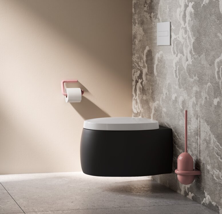
Barbiecore: How pink is used specifically as a brand element
The trend colours in the hotel industry have changed considerably in recent years. While muted earth tones and neutral colours continue to play a central role, many hotels are consciously opting for colour accents to create an individual brand identity.
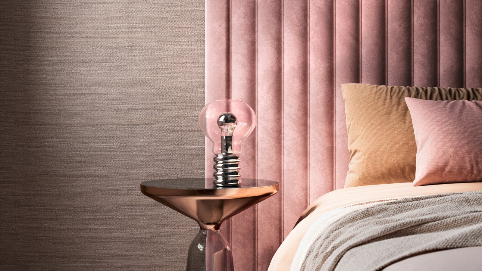
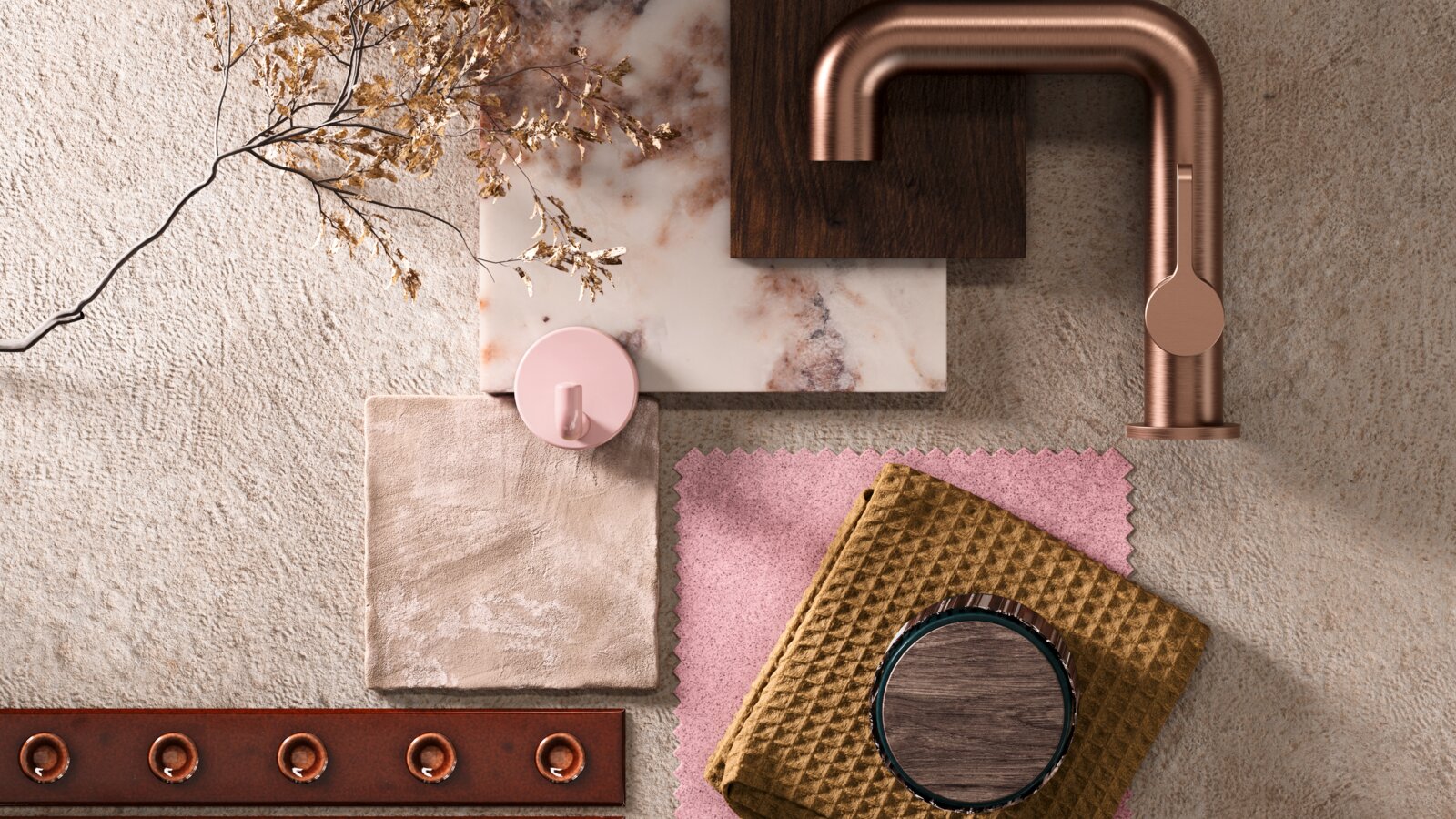
Pink as a design element is increasingly being combined with high-quality materials to create an exclusive atmosphere. Marbled tiles with hints of rosé, velvet fabrics in dusky pink or cabinet furniture in soft pastel shades create a harmonious yet striking room effect. Pink unfolds its full elegance especially in combination with black, gold or white.
In the Barbiecore aesthetic room, these elements merge to create a design-orientated room composition that is both functional and emotionally appealing.
Best practice examples: Boutique hotels are focusing on pink as a design statement
The pink hotel trend can already be seen in numerous design hotels around the world. Boutique hotels in particular focus on colour concepts that stand out from classic hotel designs. Some outstanding examples:
Pink Palm Hotel, Miami: Combination of pastel-coloured sanitary areas and minimalistic black and white elements for a modern, Instagram-worthy design.
Hotel Paradiso, Ibiza: Pink accents in furniture, walls and decor create a relaxed, stylish atmosphere for lifestyle travellers.
The Goodtime Hotel, Florida: Pink and coral tones as a central design element, combined with geometric patterns and golden accents.
These hotels show that colour design is not just an aesthetic decision, but also contributes strategically to brand positioning and guest loyalty.
Conclusion: Colour strategies as a competitive advantage in the hotel industry
Targeted colour schemes are becoming increasingly important in hotel interior design. The pink hotel trend exemplifies the transformation of the hotel industry towards more individual, design-oriented and brand-conscious concepts.
Colour psychology hotel design and functional aesthetics go hand in hand: While colours are used specifically to appeal to guests on an emotional level, high-quality materials and intelligent designs ensure a long-term increase in value.
The Barbie™ x HEWI collection shows that inclusivity, design standards and economic success are not mutually exclusive – but can be combined as a forward-looking strategy.
BARBIE™ and associated trademarks and trade dress are owned by, and used under license from, Mattel. ©2026 Mattel.
